Contents
Analytics Paints the Picture. It Does Not Prove the Story.
🍎 Low Hanging Fruit
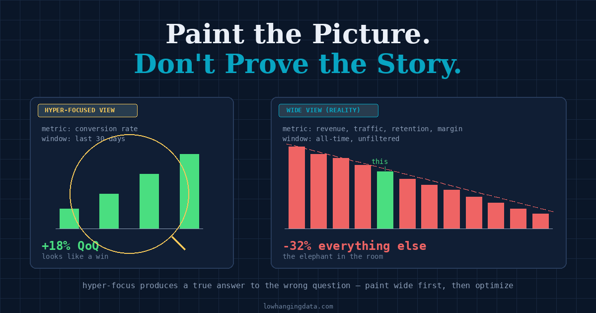
The dashboard shows conversion rate up 18% quarter-over-quarter. Leadership is happy. The growth team writes a victory-lap memo. Two months later, revenue is down 12% and nobody can explain it.
The conversion rate genuinely improved. The funnel got faster. The work was real.
The trap: while everyone was optimizing the bottom of the funnel, the top was collapsing. Traffic dropped by a third. Conversion rate went up because the cohort still visiting the site was self-selecting harder — exactly the people who were already going to convert. The “win” was the survivorship bias of a shrinking audience.
A wider view would have shown that the moment somebody pulled it. Nobody pulled it, because the narrower view was already telling a story everyone liked.
This is the failure mode that hides behind most “data-driven” decision-making: analytics that confirms the narrative the requester walked in with, instead of painting a picture of what is actually happening.
The Goal Is to Paint, Not to Prove
The job of analytics is unglamorous when stated honestly. It is to render reality clearly enough that someone can decide what to do next. That is the whole product. Not to confirm a hunch. Not to justify a roadmap. Not to make a quarterly report look defensible. Render reality. Decide the next move.
The order matters. Painting first, optimizing second is the only sequence that produces decisions which survive contact with the next quarter. The reverse — picking a metric to move and then arranging the data to demonstrate that you moved it — produces stories that fall apart the moment somebody looks past the frame.
A narrative pulls focus to whatever supports it. A picture forces you to include everything in the room, including the parts that contradict you. Most of the value in good analytics lives in the parts you would not have looked at if you were trying to be persuasive.
How Hyper-Focus Hides the Elephant
The most common form of bad analytics is not wrong numbers. It is correct numbers about the wrong slice. The slice gets chosen before the picture gets painted, and once that happens, the elephant in the room is structurally invisible.
Some recognizable shapes:
- The metric you can move. The team focuses on whatever lever they own. The lever moves. The business does not. Nobody zooms out to check whether the lever was attached to anything.
- The cohort that converts. Analysis runs on users who completed the action. The 92% who bounced are excluded from the chart, then forgotten from the discussion.
- The window that flatters. Last 30 days. Last quarter excluding the holiday dip. Year-over-year skipping the launch quarter. Each window choice is individually defensible. The cumulative effect is a curated reality.
- The benchmark of one. Performance compared to last week, not to peers, not to industry, not to absolute targets. The trend looks fine. The level is catastrophic.
- The segment that matches the thesis. Splitting by the one dimension where the story holds, and not by the three dimensions where it does not.
None of these are dishonest in isolation. Each is a reasonable choice an analyst could defend. The dishonesty — to the extent it exists — is in the failure to also run the analysis from the angles that might show something inconvenient.
Hyper-focus is the silent failure mode because it never produces a wrong answer. It produces a true answer to a question nobody should have asked first.
The Narrative Sneaks in Through Defaults
A narrative does not usually arrive as a sentence. It arrives as a default. Every default in a chart is an opinion, and most of them get adopted without anyone noticing.
chart_type   = line          → assumes continuity matters
y_axis       = starts at 0?  → controls how big the change looks
time_window  = last 90 days  → excludes the quarter we do not talk about
segment_by   = customer_tier → ignores acquisition channel entirely
baseline     = last month    → not the launch month, not the industry
exclusions   = test users    → also: power users? also: bots? also: ...?
Pick a different set of defaults and the same dataset tells a different story. That is not because data is subjective. It is because reality is high-dimensional, and any single chart is a projection of it onto a plane. The plane you pick is the picture you paint.
The discipline is to notice that you are picking — and to paint at least two pictures from different angles before deciding which is the real one.
Paint Wide First, Then Optimize
There is a working order that prevents most narrative-driven analytics:
- Start with the widest possible view. The total. The all-time. The unfiltered. Before anything else, look at the boring number that includes everything. Most of the time, this is where the actual story lives, and it is almost always the chart nobody asked for.
- Find the dominant signal. Within the wide view, what is the biggest movement? Not the one you expected — the biggest one. If the dominant signal is not the one the request was about, the request was about the wrong thing.
- Now narrow in. Once you have the wide picture and the dominant signal, drill into segments, cohorts, and time windows. The narrowing is informed by reality instead of by the question that arrived.
- Re-paint at each level. Every time you narrow, draw the boring chart again. The shape often changes. The shape changing is the finding.
- State what would change your conclusion. Before recommending an action, name the assumption that — if wrong — would flip the recommendation. That assumption is what to test next.
The first three steps cost an extra hour. They prevent most of the rework that hyper-focused analyses generate downstream, because the wide picture catches the elephant before the narrow picture spends a week describing the elephant’s left ear in great detail.
How to Tell If You Are Painting or Pitching
A few signals that an analysis has slid from picture to narrative, in increasing order of severity:
| Signal | What it usually means |
|---|---|
| The recommendation was decided before the analysis started | The analysis is documentation, not investigation |
| Every chart in the deck supports the same conclusion | The contradicting data was filtered out, not addressed |
| The wide view is missing entirely | The story only works at one zoom level |
| Anomalies are footnoted, not explained | The story does not survive looking at them |
| The “what would change my mind” section is empty | There is no falsifiable claim — only a position |
None of these mean the analyst is being dishonest. Most of the time they mean the analyst was asked a leading question and is doing what they were asked. The damage is the same.
The Cost of a Pretty Story
A narrative-driven analysis is cheap to produce and expensive to discover. The cost lands months later, when the decision made on the basis of the story collides with the part of reality the story left out.
A few places it shows up:
- Roadmaps built on the wrong driver. Six months of engineering investment aimed at the metric that moved, while the metric that mattered drifted out of view.
- Vanity wins that mask underlying decline. Conversion up, traffic down. Engagement up, audience smaller. Margins up, demand collapsing. Each pair tells a different story depending on which side of it you put on the slide.
- Stakeholders who stop trusting analytics entirely. When the third “win” turns out to have been a survivorship-bias artifact, the executive team stops asking for analysis and starts going with their gut. The analytics function loses the room.
The last one is the worst, because it is irreversible on the timeline of most jobs. A team that has shipped two or three confidently wrong stories rarely gets a fourth swing.
What Optimization Looks Like After the Picture Is Painted
Once the wide picture is on the table, optimization stops being a guess. The dominant signal points at the part of the system that matters most, and the levers worth pulling become visible by elimination — everything else moves the small bars while the big bar drifts.
This is the moment analytics earns its keep. Not in the recommendation, which any consultant could write. In the ordering: which thing to fix first, which to defer, which to stop measuring because it is not the lever it was assumed to be. That ordering is downstream of having painted honestly. There is no shortcut to it.
A team that paints first treats the recommendation as a consequence of the picture. A team that pitches first treats the picture as decoration around a pre-written recommendation. The two postures produce indistinguishable slide decks and wildly different outcomes.
The Low Hanging Fruit
Before scoping the next analysis, force a wide-view pass:
- Pull the all-time, all-segment, unfiltered version of the metric the request is asking about. Look at it for two minutes before doing anything else.
- Ask: is the request still the right question after looking at this? Often it is not. Often the elephant was visible the moment the chart was unfiltered.
- Then narrow — informed by what the wide view said, not by what the request implied.
The goal of analytics is not to validate the narrative that arrived with the request. It is to paint reality clearly enough that the next move is obvious. If the picture you painted is flattering, be suspicious. If it is uncomfortable, it is useful. If it is mixed, it is probably accurate.
Optimization is the easy part. Painting honestly is the part that earns the right to recommend.
Related Articles
- The Telephone Game Is How Analytics Goes Wrong — The other half of the framing problem: what gets lost between the person who has the question and the person who answers it.
- Write for the Executive. Survive the Analyst. — Once you have painted the picture honestly, how to package it so the decision-maker can act on it without it falling apart in review.
- The Gas Gauge Is the Hardest Chart to Build — The discipline of committing to what “good” looks like before the picture is drawn.
- Don’t Build Analytical Castles on Sand — The other reason analyses fall apart later: the foundation underneath them was never solid.