Contents
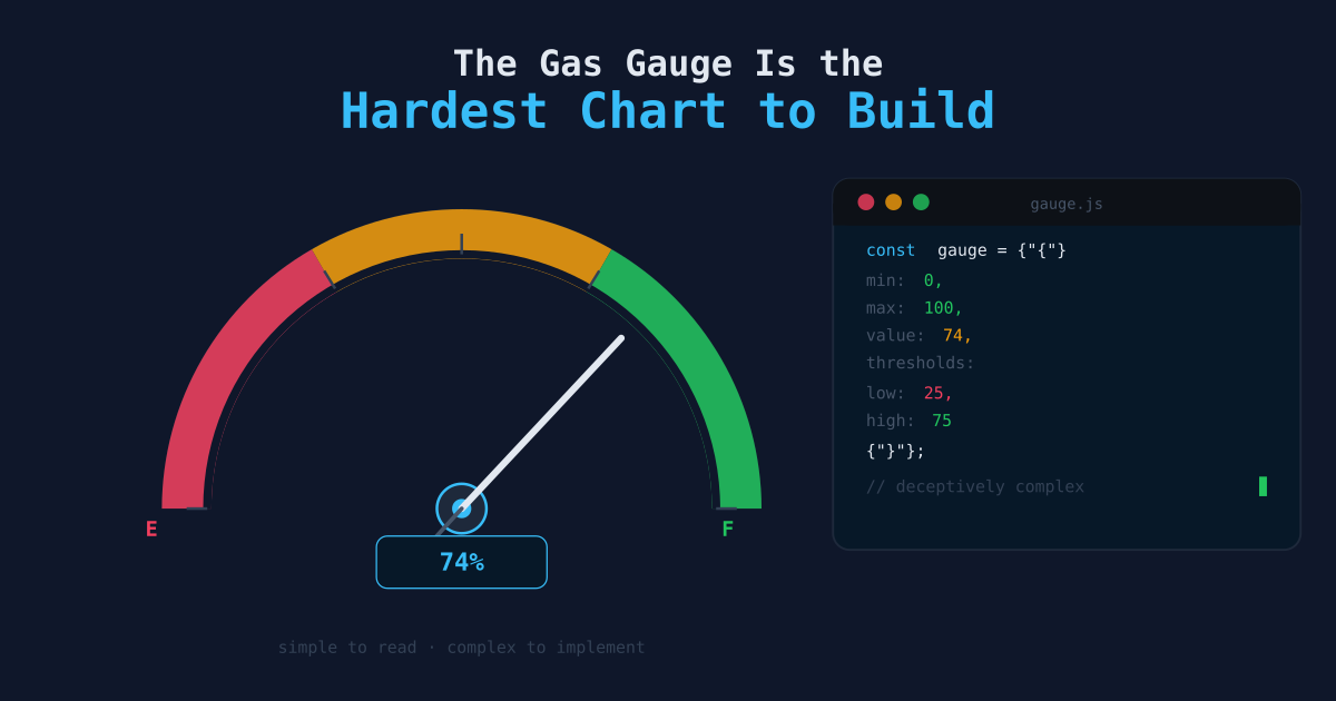
The Gas Gauge Is the Hardest Chart to Build
🍎 Low Hanging Fruit
The gas gauge gets no respect in data circles. It shows up in dashboards built by people who “just want something simple.” It gets replaced in redesigns by line charts and scatter plots that signal sophistication. Analysts fresh out of bootcamp learn to avoid it.
This is exactly backwards. A gas gauge is not a sign that the builder did not know any better. It is a sign that the builder knew enough to pull it off.
What a Gas Gauge Actually Requires
A gas gauge — a single needle on a dial, or a filled arc, or a colored progress bar — has exactly one job: tell you whether you are good, bad, or somewhere in between.
That job is harder than it looks. To build a gas gauge that means anything, you need to answer questions that most metrics never get:
- What is “full”? What value represents the best realistic outcome for this metric?
- What is “empty”? At what point does this number become a problem?
- Where are the thresholds? Is 70% of target a yellow light or a red one?
- Are those thresholds static or dynamic? Does “good” change by season, by segment, by market?
- What causes the needle to move? If the gauge swings, do you know why?
A line chart sidesteps all of these questions. It shows you what happened. It does not tell you how to feel about it. A gas gauge cannot sidestep them. The moment you drop a needle on a dial, you have committed to a point of view about what good looks like.
If you do not have that point of view, the gauge is meaningless — and building it will expose that immediately.
The Line Chart Is Easier to Fake
Here is the uncomfortable truth about most dashboards: the charts in them do not represent genuine understanding. They represent data that exists.
A line chart of monthly active users is easy to make. Pull the data, plot the dates on X, the count on Y, ship it. The chart looks authoritative. It has a trend. It has grid lines. Stakeholders nod.
But ask the person who built it: Is this number good right now?
Watch what happens. They will point at the direction of the line. “It’s going up.” Okay — but is 42,000 monthly active users healthy for this product, at this stage, in this market? Is it ahead of where you need to be, or dangerously behind? What would 42,000 mean in February versus July?
The line chart does not require you to have answers to those questions. The gas gauge does.
Line chart:  "Here is what the number has been doing."
Gas gauge:   "Here is where the number stands relative to what matters."
The first sentence is easy. The second one requires you to have done the work.
When Thresholds Are Wrong, the Gauge Breaks
The failure mode of a bad gas gauge is instructive. Set your thresholds arbitrarily — maybe you made “green” everything above 80% of some target, because 80% felt reasonable — and the gauge will lie to you.
It will show green when the business is in trouble, because the target was too low. It will show red when the team is performing well, because the threshold was calibrated to last year’s scale. It will stop being read, because people learn that the gauge is not trustworthy.
Bad gauge threshold:  "Above 80% of target is green."
Where 80% came from:  Nobody remembers.
Result:               The needle lives in green permanently.
                      The business loses $2M in Q3.
                      Everyone blames the dashboard.
Compare this to a gauge built on genuine understanding:
Good gauge threshold: "Below 90% of target is yellow. Below 75% is red.
                       These figures come from margin analysis — below 75%,
                       we cannot cover fixed costs. Below 90%, we are behind
                       the growth curve needed to hit the annual plan."
Where this came from:  Finance sign-off on 2025-11-04.
Result:                The needle moves to yellow in February.
                       The team investigates. A pricing change is reversed.
                       Q3 comes in at 96%.
The gauge in the second example is not a visualization. It is organizational knowledge made visible.
Gas Gauges as a Test of KPI Maturity
There is a useful exercise for any metric your team tracks. Ask the people responsible for it to build a gas gauge. Not to actually ship it — just to spec it out on paper.
They have to answer:
- What is the current value?
- What is the best realistic value we should aim for?
- At what value is this a problem we act on?
- At what value is this a crisis?
If they can answer all four without hedging, the metric is well-understood. If they cannot — if the thresholds feel arbitrary, or if there is disagreement about what “crisis” means — then the metric is not actually being managed. It is just being tracked.
This is more common than it should be. Teams collect metrics they do not understand. They watch numbers go up and down without knowing what range is acceptable. They react to movement rather than position. They confuse “this looks different from last month” with “this is bad.”
| Maturity Level | What They Can Do |
|---|---|
| Level 1: Tracking | ”Here is the current value.” |
| Level 2: Trending | ”Here is whether it went up or down.” |
| Level 3: Gauging | ”Here is whether it is good or bad, and why.” |
| Level 4: Predicting | ”Here is where it is headed and what levers we have.” |
A gas gauge lives at Level 3. Most dashboards never get there.
The Deceptive Simplicity of the Output
This is the part that makes gas gauges easy to underestimate. The output is simple: a position on a scale, a color, a single number. A junior analyst looks at it and thinks it was easy to make.
The simplicity of the output is the point. The work is not in the rendering — it is in arriving at a shared, defensible answer to “what does good look like?”
Think about what goes into a well-calibrated gauge for something like customer support ticket backlog:
- Historical data on what backlog levels preceded SLA breaches
- Seasonality — backlog in January looks different from backlog in December
- Team capacity — the threshold should adjust when headcount changes
- Segment weighting — a backlog of enterprise tickets is not the same as a backlog of free-tier tickets
- Escalation paths — who acts when the needle hits yellow, and what do they do?
None of that shows up on the gauge. The gauge just shows a needle. But the needle is only meaningful because all of that work happened upstream. The simplicity of the output is earned by the complexity of the thinking.
Remove the thinking, and you have a needle pointed at a number that nobody believes.
Why This Matters for Data Work
The habits that make a good gas gauge are the same habits that make good data work in general.
Defining thresholds forces you to make decisions explicit. Implicit thresholds — the kind that live in people’s heads as vague feelings about whether a number is okay — are dangerous. They shift. They vary by person. They cannot be audited. A gas gauge requires you to write them down.
Writing them down forces you to defend them. Once a threshold is visible on a dashboard, people will challenge it. “Why is red below 75%?” That question is good. It starts the conversation about whether the threshold is right. Implicit thresholds never get challenged because nobody knows they exist.
Defending them builds shared understanding. When Finance, Operations, and Leadership all agree that 75% is red and 90% is yellow, you have organizational alignment on what the metric means. That alignment is worth more than the dashboard that displays it.
The alignment surfaces when something goes wrong. When the needle hits red and the room does not know what to do next, it means the threshold was never really agreed on. When the room immediately kicks into a defined response, it means the work was done.
The Low Hanging Fruit
If you have a metric that matters — something your team looks at weekly, something that feeds into decisions — try the gas gauge test.
Can you define the thresholds, in writing, with stakeholder sign-off?
If yes: build the gauge. It will be the most useful chart on your dashboard.
If no: stop building charts for that metric until you can. A line chart of a number you do not understand is noise dressed up as signal. It will make your stakeholders feel informed while they are not.
The gas gauge is dumb in the way that a one-sentence summary of a complex report is dumb — it collapses a lot of work into a simple output. That simplicity is a feature. It means the analysis is done. It means the insight is portable. It means anyone who looks at the dashboard knows, in two seconds, whether to be concerned.
You either understand what is good or bad, or you cannot make a gas gauge. That is not a limitation of the chart type. It is the whole point.
Related Articles
- KPIs Are a Cultural Change, Not a Dashboard Project — Why defining thresholds is only half the work — the other half is organizational commitment to act on them.
- Dashboards Are Waiting Rooms: Interconnectivity Is the Endgame — What comes after you build the gauge: automating the response when the needle moves.
- Not Everyone Is a Data Analyst — The gas gauge is the right deliverable for a non-analyst audience — here is the broader principle behind that.